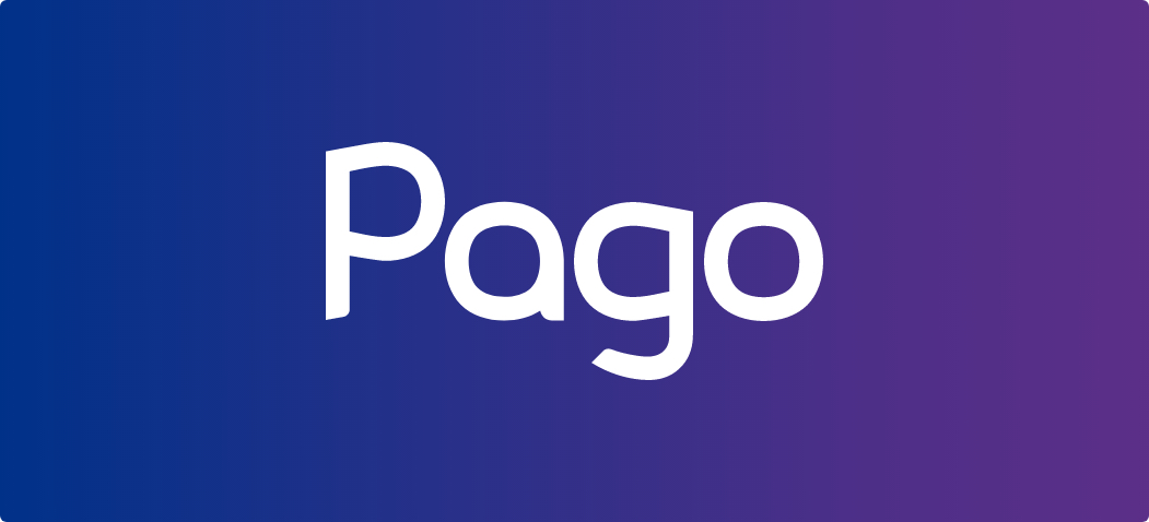
In 2017, when we launched Pago and its first logo, the app only had a fraction of the current features, and it was mostly focused on utility bills issued by the 40 suppliers initially available at launch. Since then, the number of suppliers increased to over 340, accounting for over 95% of the Romanian utility companies, and we added new payment types such as mobile top-ups, insurance, taxes, donations and we are currently working to add card to card money transfers.
We felt for some time now that our logo needs a refresh, which should illustrate who we are now, as Pago – the app, and also as a team – 25 employees and collaborators in Romania and abroad. The logo we have become so used to represent the idea of a house and the main utilities which need to be paid every month, but the app is so much more today. Our vision is to help users spend their time on what really matters – as a result, the app’s design illustrates this vision: simple, easy to use, secure and reliable.
A new visual identity
The new logo represents Pago’s evolution, from the mobile app, to our mission and team.
We wanted to create a visual language that would unite the entire Pago experience, from the app to the website, to social media, and to the way we communicate with our users.
A new, modern and timeless visual language that creates space for the evolution of the product, that adapts to new needs and aligns with people’s expectations about Pago.
The process
Pago has evolved a lot since it launched in 2017. With more than 190.000 monthly active users, Pago followed up on its promise to make people’s lives easier by expanding the list of service providers and adding new payment types, like mobile top-ups, insurance, donations, and others to follow.
We knew from the beginning we wanted a custom font because it adds something unique to a brand, and it is a powerful asset that can help our brand stand out.
More than graphic design, typography is an expression of technology, precision and good order. Typography is no longer concerned with meeting the lofty and difficult demands of art but with satisfying, formally and functionally, the everyday requirements of a craft.
Emil Ruder
With that in mind we went searching for the perfect typeface :


Once we identified details as angles, sheer and proportions, by balancing the idea of playfulness, friendliness, and professionalism, we continued to iterate and look for letter styles.


After more than 100 iterations we found what we were looking for.
Colors
As we look into the future, we kept some elements from the previous logo, such as the gradient, which is a reminder that we started this to make people’s lives easier and give them freedom and time back so they can invest it in more meaningful things.
What’s next?
By the end of the year we will bring big improvements to our app’s design, develop new features and improve the existing ones.
Pago will continue to evolve, change visually and add new services. We feel our new logo now allows this, with an expansion from our initial focus on utility bills. Over the next few months, we will bring other visual updates aligning with the new direction: on the website, on our social media and in our advertising.
It’s still us but more consistent and, we hope, more instantly recognizable.


